#Shipped | #brand identity | #non-profit

Electric Potential

Electric Potential is a startup dedicated to equipping Gen Z with the resources and tools they need to launch careers in social change. Our mission is to empower young people to make a positive impact in their communities and beyond. Our goal was to refresh Electric Potential’s brand identity to focus on community and empowerment. We aimed to create a more dynamic and impactful design that resonates with Gen Z, while promoting the company’s core values of community, education, positive energy, and social responsibility.

Electric Potential is a startup dedicated to equipping Gen Z with the resources and tools they need to launch careers in social change. Our mission is to empower young people to make a positive impact in their communities and beyond. Our goal was to refresh Electric Potential’s brand identity to focus on community and empowerment. We aimed to create a more dynamic and impactful design that resonates with Gen Z, while promoting the company’s core values of community, education, positive energy, and social responsibility.

Role

Brand and Visual Identity

team

1 Design Manager 3 Brand Identity Designers

timeline

6 Weeks

industry

B2B, B2C

WHAT I DID
THE BRIEF
∙ LOGO DESIGN
∙ color palette
∙ typography
∙ feedback sessions

When my teammates and I began working on Electric Potential’s brand refresh, our goal was to create a visual identity that would better align with the company’s evolving mission and resonate more deeply with Gen Z. Electric Potential had already established a brand, but as the company grew and our needs changed, our Executive Director proposed the idea of refreshing the brand identity to more accurately reflect the energy and passion behind our mission. This led to the development of a new brand identity that combines vibrant, energetic design with a focus on community and empowerment.

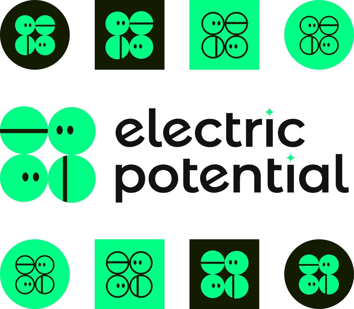
The rebrand features a dynamic logo that includes abstract "sprites" and an electric spark, symbolizing energy, innovation, and connection — core themes of our mission. The updated typography and color palette were chosen to reinforce the brand’s bold, modern voice and engage a generation motivated to create change. These design choices aim to inspire and connect with Gen Z, making them feel a part of the larger mission of social impact.

Reflecting on the brand identity journey, Electric Potential has successfully created a visual identity that aligns with the company’s mission to equip and empower Gen Z for social change. The positive reception of the new design demonstrates that a thoughtful, engaging identity can spark excitement and community connection. This project is a reminder that design, when approached with purpose, can help elevate a brand’s mission and inspire meaningful change.

ELECTRIC POTENTIAL PURPOSE STATEMENT

To catalyze Gen Z to become agents of social change.

To catalyze Gen Z to become agents of social change.

To catalyze Gen Z to become agents of social change.

final brand identity
type and color

The visual identity is mindful of Electric Potential’s commitment to creating strong and informed communities through education and the free distribution of knowledge.

We chose Neue Haas Grotesk Display Pro, a sleek sans-serif font known for its exceptional readability and timeless appeal. The font’s versatility ensures it performs well across both digital and print mediums, providing a professional yet approachable tone that supports our brand's goal of fostering learning and empowering communities.

The color palette is comprised of vibrant, bold, and energetic colors that embody the dynamic energy driving Electric Potential. These electric hues not only reinforce the brand’s "electric" identity but also evoke a sense of excitement, innovation, and possibility. Together, they represent the spark of change we aim to ignite within Gen Z, inspiring action and fostering an atmosphere of creativity, urgency, and progress in the pursuit of social impact.

iPhone app screen playing recorded audio from dog
iPhone app screen allowing user to set dog’s voice
iPhone app screen scanning dog’s Barc* device using the camera

Step 01

Clip your Barc* and scan to sync

Simply attach the device to your dog’s collar and have them give a few Barcs* to calibrate their voice while scanning with our mobile app.

iPhone app screen playing recorded audio from dog
iPhone app screen allowing user to set dog’s voice
iPhone app screen scanning dog’s Barc* device using the camera

Step 02

Set your dog’s voice

Use AI to create a voice that your dog would actually sound like. You can also select from a list of celebrity voices.

iPhone app screen playing recorded audio from dog
iPhone app screen allowing user to set dog’s voice
iPhone app screen scanning dog’s Barc* device using the camera

Step 03

Listen live or from your Barc*hive

Your dog’s Barc*s will be played from their device, but we also record every Barc* for your remote listening or future playback.

a peek into the process

Electric Potential’s brand identity was created through a thoughtful, iterative process involving

Electric Potential’s brand identity was created through a thoughtful, iterative process involving

Electric Potential’s brand identity was created through a thoughtful, iterative process involving

Purpose statement
Feedback sessions
Social media design

Purpose statement
Feedback sessions
Social media design

Purpose statement
Feedback sessions
Social media design

Take a look at our full process in detail below.

Take a look at our full process in detail below.

Take a look at our full process in detail below.

the process
assessing the outdated brand identity

As our brand evolved, it became clear that our visual identity no longer aligned with our mission. The outdated logo, colors, and typeface failed to communicate the energy and core values our brand strives to embody. In order to better reflect our commitment to education, social impact, and community, we recognized the need to reassess and update our brand identity for a more cohesive and impactful brand presence.

OUTDATED BRAND IDENTITY: LOGO

Our previous logo and color palette no longer captured the dynamic, energetic identity we wanted to convey. The logo, with its cursive "e" and "p," felt too unaligned and forgettable, lacking the electric and vibrant essence central to our brand. It also failed to communicate our core values, such as diversity, community, and the power of the people’s voice to influence social change. Similarly, the color palette’s muted tones lacked the energy and vibrancy we were focusing our brand around. Ultimately, we recognized that our visual identity no longer aligned with our evolving mission and the direction we wanted to take.

OUTDATED BRANDING: TYPE

Our previous typeface, Poppins, while clean and modern, is not well-suited for a brand focused on providing educational resources. Its design is not ideal for long-form text or dense documents, as it lacks the readability and clarity required for extended reading. Additionally, it did not convey the level of seriousness necessary for a brand centered around education and social impact. We wanted a typeface that could support our mission with greater legibility and a more authoritative tone.

iPhone app screen playing recorded audio from dog
iPhone app screen allowing user to set dog’s voice
iPhone app screen scanning dog’s Barc* device using the camera

Step 01

Clip your Barc* and scan to sync

Simply attach the device to your dog’s collar and have them give a few Barcs* to calibrate their voice while scanning with our mobile app.

iPhone app screen playing recorded audio from dog
iPhone app screen allowing user to set dog’s voice
iPhone app screen scanning dog’s Barc* device using the camera

Step 02

Set your dog’s voice

Use AI to create a voice that your dog would actually sound like. You can also select from a list of celebrity voices.

iPhone app screen playing recorded audio from dog
iPhone app screen allowing user to set dog’s voice
iPhone app screen scanning dog’s Barc* device using the camera

Step 03

Listen live or from your Barc*hive

Your dog’s Barc*s will be played from their device, but we also record every Barc* for your remote listening or future playback.

direction
direction
direction

While we aimed to update our design, we wanted to retain two key elements: the "e" and "p" from our original logo to keep our brand name present, and the spark, which effectively conveyed the "electric" nature of our brand. These elements were important to us because they represented both our identity and the energy we wanted to project, while still allowing us to refresh and modernize our overall visual direction.

brand voice and audience

To effectively create a brand identity that resonates with our audience and conveys the core values our brand is centered around, we needed to revisit the values, messaging, and target audience of our business. The foundation of our brand voice had already been established by our Executive Director, and this brand refresh allowed us to better align our visual identity with the established brand messaging and personality. By referencing this foundation, we ensured that the new design and direction stayed true to our core mission and would continue to engage and inspire our audience in a meaningful way.

To effectively create a brand identity that resonates with our audience and conveys the core values our brand is centered around, we needed to revisit the values, messaging, and target audience of our business. The foundation of our brand voice had already been established by our Executive Director, and this brand refresh allowed us to better align our visual identity with the established brand messaging and personality. By referencing this foundation, we ensured that the new design and direction stayed true to our core mission and would continue to engage and inspire our audience in a meaningful way.

To effectively create a brand identity that resonates with our audience and conveys the core values our brand is centered around, we needed to revisit the values, messaging, and target audience of our business. The foundation of our brand voice had already been established by our Executive Director, and this brand refresh allowed us to better align our visual identity with the established brand messaging and personality. By referencing this foundation, we ensured that the new design and direction stayed true to our core mission and would continue to engage and inspire our audience in a meaningful way.

direction
direction
direction

Given our messaging and audience, our goal was to ensure our refreshed brand identity invoked a sense of community, boldness, passion, and positive energy. As a company focused on social change, we needed to strike a balance between conveying the seriousness of our mission, while also capturing the dynamic, youthful spirit of our target audience. This required a visual identity that was both engaging and inspiring, reflecting the energy of Gen Z and the urgency of the social impact work we champion.

ideation
ideation
ideation

Our brainstorming stage began with sketching out ideas, exploring different designs and geometric combinations that would best represent Electric Potential’s mission and values. From there, we translated our sketches into vector designs to refine and better visualize our ideas. This process allowed us to experiment with a variety of shapes and symbols that could be used to represent our brand.

Our brainstorming stage began with sketching out ideas, exploring different designs and geometric combinations that would best represent Electric Potential’s mission and values. From there, we translated our sketches into vector designs to refine and better visualize our ideas. This process allowed us to experiment with a variety of shapes and symbols that could be used to represent our brand.

Our brainstorming stage began with sketching out ideas, exploring different designs and geometric combinations that would best represent Electric Potential’s mission and values. From there, we translated our sketches into vector designs to refine and better visualize our ideas. This process allowed us to experiment with a variety of shapes and symbols that could be used to represent our brand.

sketch
sketch
sketch
vector
vector
vector
REASSESSING THE OUTDATED LOGO DESIGN

While we were satisfied with our initial designs, they did not fully capture the key elements we were aiming for, such as the integration of “e” and “p”, the representation of community, and the “electric” personality of our brand. As a result, we revisited our previous logo to explore how it could be modified to more effectively reflect the core elements of our mission.

While we were satisfied with our initial designs, they did not fully capture the key elements we were aiming for, such as the integration of “e” and “p”, the representation of community, and the “electric” personality of our brand. As a result, we revisited our previous logo to explore how it could be modified to more effectively reflect the core elements of our mission.

While we were satisfied with our initial designs, they did not fully capture the key elements we were aiming for, such as the integration of “e” and “p”, the representation of community, and the “electric” personality of our brand. As a result, we revisited our previous logo to explore how it could be modified to more effectively reflect the core elements of our mission.

iteration
iteration
iteration

We decided to explore new ideas as we were still not satisfied with the previous design, even after the revisions we made. Revisiting the concept of “e” and “p” in our outdated logo, we brainstormed various ways to incorporate those letters more originally and uniquely into our design.

We decided to explore new ideas as we were still not satisfied with the previous design, even after the revisions we made. Revisiting the concept of “e” and “p” in our outdated logo, we brainstormed various ways to incorporate those letters more originally and uniquely into our design.

We decided to explore new ideas as we were still not satisfied with the previous design, even after the revisions we made. Revisiting the concept of “e” and “p” in our outdated logo, we brainstormed various ways to incorporate those letters more originally and uniquely into our design.

incorporating company values

After several rounds of iteration and refinement, we landed on a design that truly resonated with us. The concept features four balls (called "sprites"), arranged in a square format, with the letters "e" and "p" subtly formed within two sprites, and a hidden spark at the center created through negative space. To evoke the concept of community, we added eyes to two of the sprites, giving them the appearance of people coming together in unity. We felt this design was a clever, original, and understated way to convey our mission and values, while maintaining the essence of our original logo.

After several rounds of iteration and refinement, we landed on a design that truly resonated with us. The concept features four balls (called "sprites"), arranged in a square format, with the letters "e" and "p" subtly formed within two sprites, and a hidden spark at the center created through negative space. To evoke the concept of community, we added eyes to two of the sprites, giving them the appearance of people coming together in unity. We felt this design was a clever, original, and understated way to convey our mission and values, while maintaining the essence of our original logo.

After several rounds of iteration and refinement, we landed on a design that truly resonated with us. The concept features four balls (called "sprites"), arranged in a square format, with the letters "e" and "p" subtly formed within two sprites, and a hidden spark at the center created through negative space. To evoke the concept of community, we added eyes to two of the sprites, giving them the appearance of people coming together in unity. We felt this design was a clever, original, and understated way to convey our mission and values, while maintaining the essence of our original logo.

electrification
electrification
electrification

In a previous iteration, we had revisited our outdated logo to see if we could modify it to better reflect our evolving brand direction. We had experimented with a modified color palette during that iteration. Now that we had settled on a new logo, we decided to revisit this color palette to better align it with our refreshed brand direction. We aimed to electrify the colors, making them bolder, more vibrant, and fitting the "electric" aspect of our brand. We modified the original blue, green, and purple to give them a neon feel, and introduced two additional colors, orange and yellow, to further enhance the dynamic energy of the palette. This update allowed the colors to better reflect the boldness and vibrancy we wanted to convey.

In a previous iteration, we had revisited our outdated logo to see if we could modify it to better reflect our evolving brand direction. We had experimented with a modified color palette during that iteration. Now that we had settled on a new logo, we decided to revisit this color palette to better align it with our refreshed brand direction. We aimed to electrify the colors, making them bolder, more vibrant, and fitting the "electric" aspect of our brand. We modified the original blue, green, and purple to give them a neon feel, and introduced two additional colors, orange and yellow, to further enhance the dynamic energy of the palette. This update allowed the colors to better reflect the boldness and vibrancy we wanted to convey.

In a previous iteration, we had revisited our outdated logo to see if we could modify it to better reflect our evolving brand direction. We had experimented with a modified color palette during that iteration. Now that we had settled on a new logo, we decided to revisit this color palette to better align it with our refreshed brand direction. We aimed to electrify the colors, making them bolder, more vibrant, and fitting the "electric" aspect of our brand. We modified the original blue, green, and purple to give them a neon feel, and introduced two additional colors, orange and yellow, to further enhance the dynamic energy of the palette. This update allowed the colors to better reflect the boldness and vibrancy we wanted to convey.

before
before
before
after
after
after
typography
typography
typography

Neue Haas Grotesk Display Pro and Helvetica Neue were the final two font options considered for our brand. Our design manager, responsible for typography, felt these two fonts were the best choices for the content we were building. We ultimately chose Neue Haas Grotesk Display Pro because it has a slightly more humanistic feel, making it warmer and more approachable while still maintaining excellent legibility and a professional appearance. This balance of sophistication and accessibility made it the ideal choice for our brand identity and the educational content we’re delivering.

Neue Haas Grotesk Display Pro and Helvetica Neue were the final two font options considered for our brand. Our design manager, responsible for typography, felt these two fonts were the best choices for the content we were building. We ultimately chose Neue Haas Grotesk Display Pro because it has a slightly more humanistic feel, making it warmer and more approachable while still maintaining excellent legibility and a professional appearance. This balance of sophistication and accessibility made it the ideal choice for our brand identity and the educational content we’re delivering.

Neue Haas Grotesk Display Pro and Helvetica Neue were the final two font options considered for our brand. Our design manager, responsible for typography, felt these two fonts were the best choices for the content we were building. We ultimately chose Neue Haas Grotesk Display Pro because it has a slightly more humanistic feel, making it warmer and more approachable while still maintaining excellent legibility and a professional appearance. This balance of sophistication and accessibility made it the ideal choice for our brand identity and the educational content we’re delivering.

UX Designer